Cotters Stay Brand Identity
We’re diving into a behind the scenes look at the brand identity creation process for Cotters Stay. Cotters Stay is a rental company that has secluded tiny home cottages perfect for a getaway retreat. They needed an updated brand identity as they had just finished renovations across the property and were wanting a fresh look for their branding too. (Brief by The Society Three)
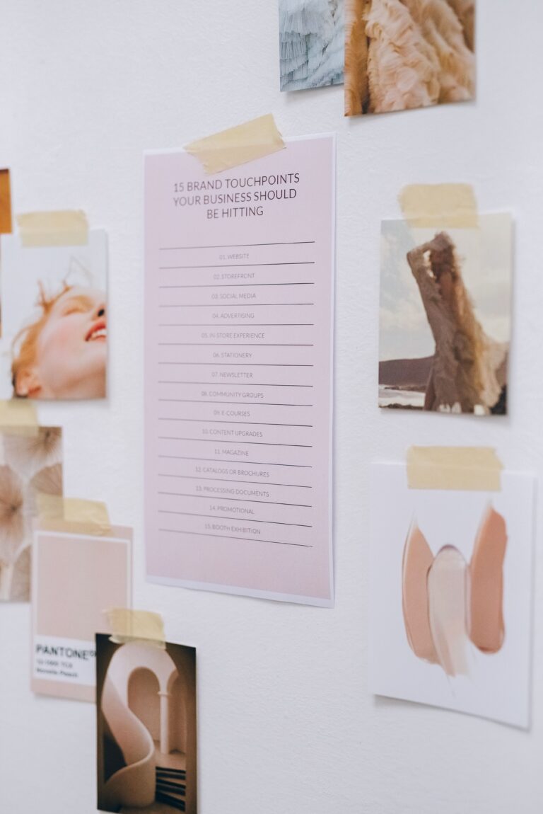
Some words that would describe their branding goals are peaceful, unplugged, and relaxing. With those words in mind, I started by finding images that invoked those feelings.

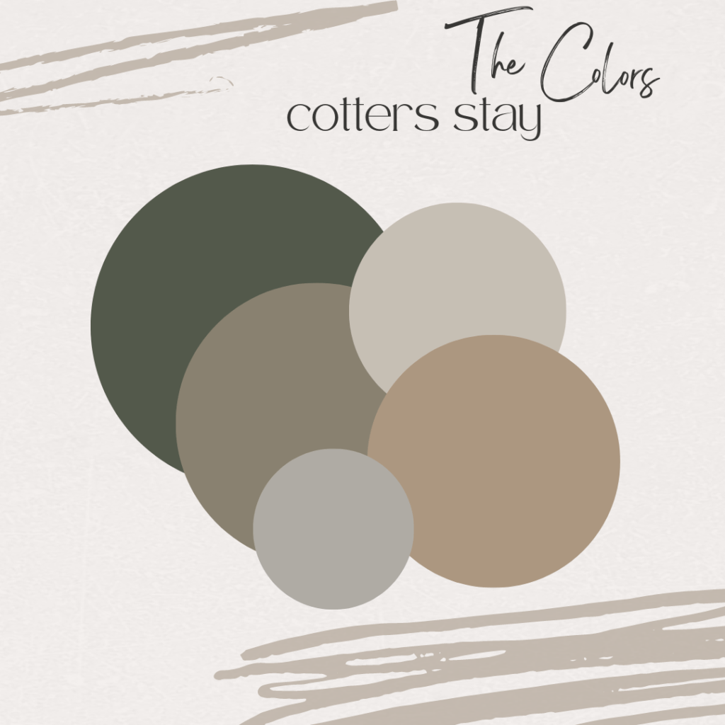
The secluded getaway brings feelings of comfort, so I wanted to bring in some warmth using the color scheme. The muted greens give a nod towards the nature that you can enjoy when going on an unplugged walk around the property. The cozy neutrals allow the focus to be on the surroundings.
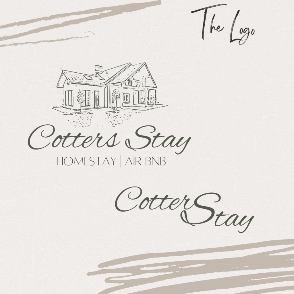
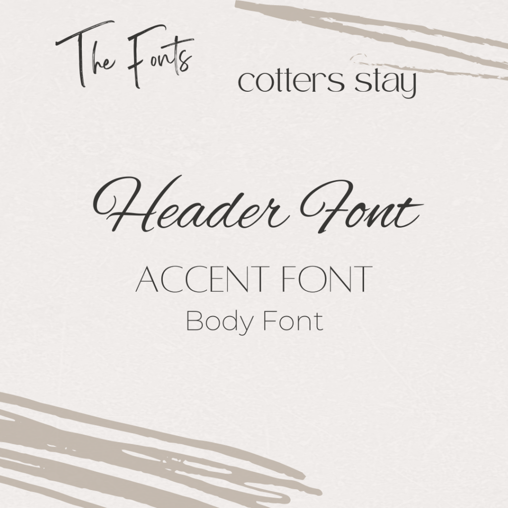
Next I trialed several font types– looking for something that was a script font to give it a welcoming, handwritten look while still being legible. I wanted something that didn’t appear rushed or too intricate. Paired with a thin sans serif font to add an unassuming professionalism, the typefaces balance each other while being varied enough to have some options in situations where they would need to use one or the other.
I wanted the logo to have an element that was uniquely Cotters Stay. I chose to have a sketched image of the building guests would see at arrival so that they would immediately have the recognition and sense of belonging upon arrival. I love doing custom elements when developing brand identities because it speaks to what is at the heart of the branding project. Of course, there is also a submark logo for the times when a larger logo would not be beneficial.