Revive+Reform

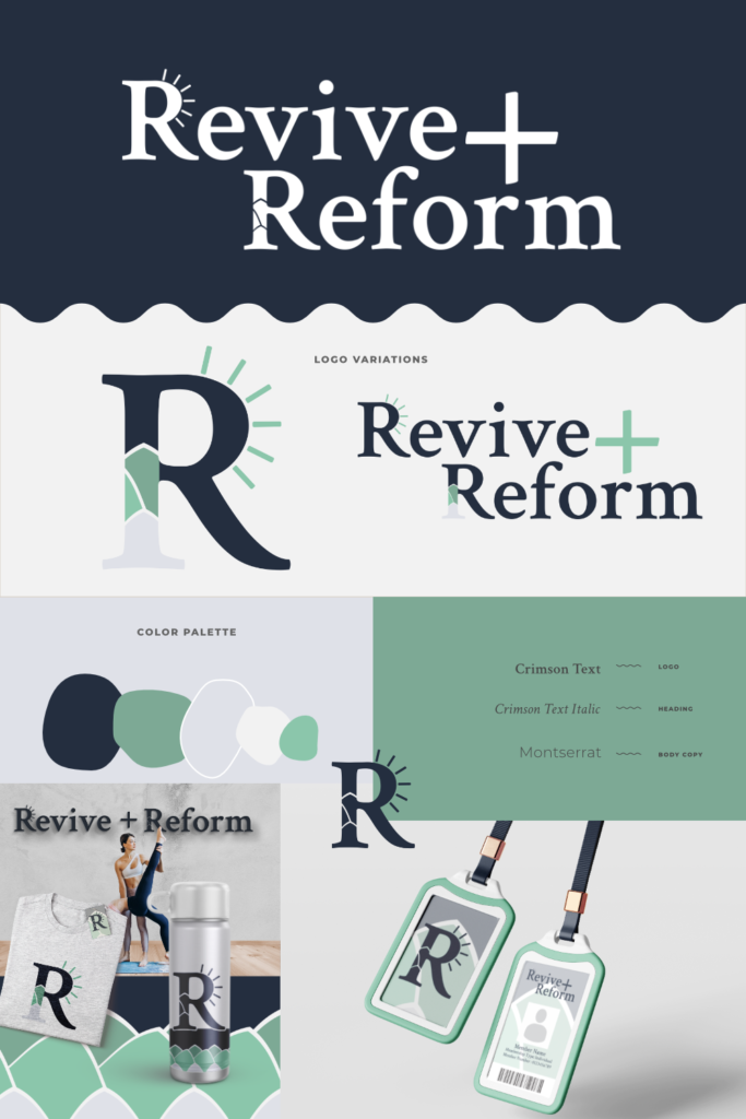
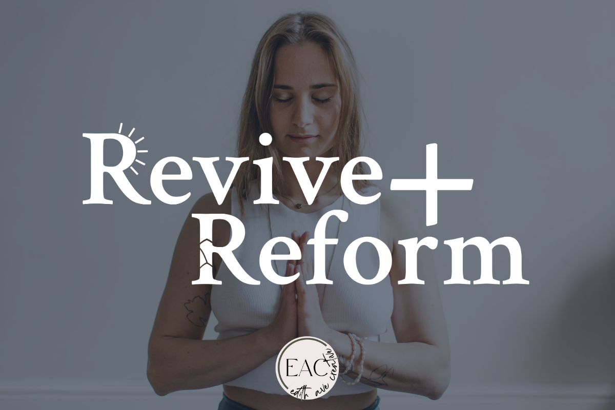
Revive+Reform is a fitness center that offers a variety of different forms of training. They’re after a brand that feels fresh and clean with a premium touch. Their important values are personal growth and confidence.

For this passion project, I wanted each of the initial letters to demonstrate the word itself. The first “R” has sun rays coming off of it to demonstrate revival. The second “R” appears to be build up from fractured pieces representing reform.

Are you interested in a brand that captures the values of your business? Send me a message to get started!

Similar Posts

  • |

    Your brand voice should be an extension of your business values and personality. It’s the consistent expression of your brand through language, tone, and communication style.

  • We’re diving into a behind the scenes look at the brand identity creation process for Scarlet Spaces. Scarlet spaces is an interior design company that…

  • We’re diving into a behind the scenes look at the brand identity creation process for Cotters Stay. Cotters Stay is a rental company that has…

  • We’re diving into a behind the scenes look at the brand identity creation process for Tranquility Wellness Spa. (brief) Some words that would describe their…

  • Have you ever created the perfect logo, only to realize down the road that it doesn’t work for whatever new thing you’re designing?

  • Graphic design isn’t just a creative choice; it’s a strategic necessity. It’s the tool that propels your brand into the hearts and minds of your audience.

Leave a Reply

Your email address will not be published. Required fields are marked *