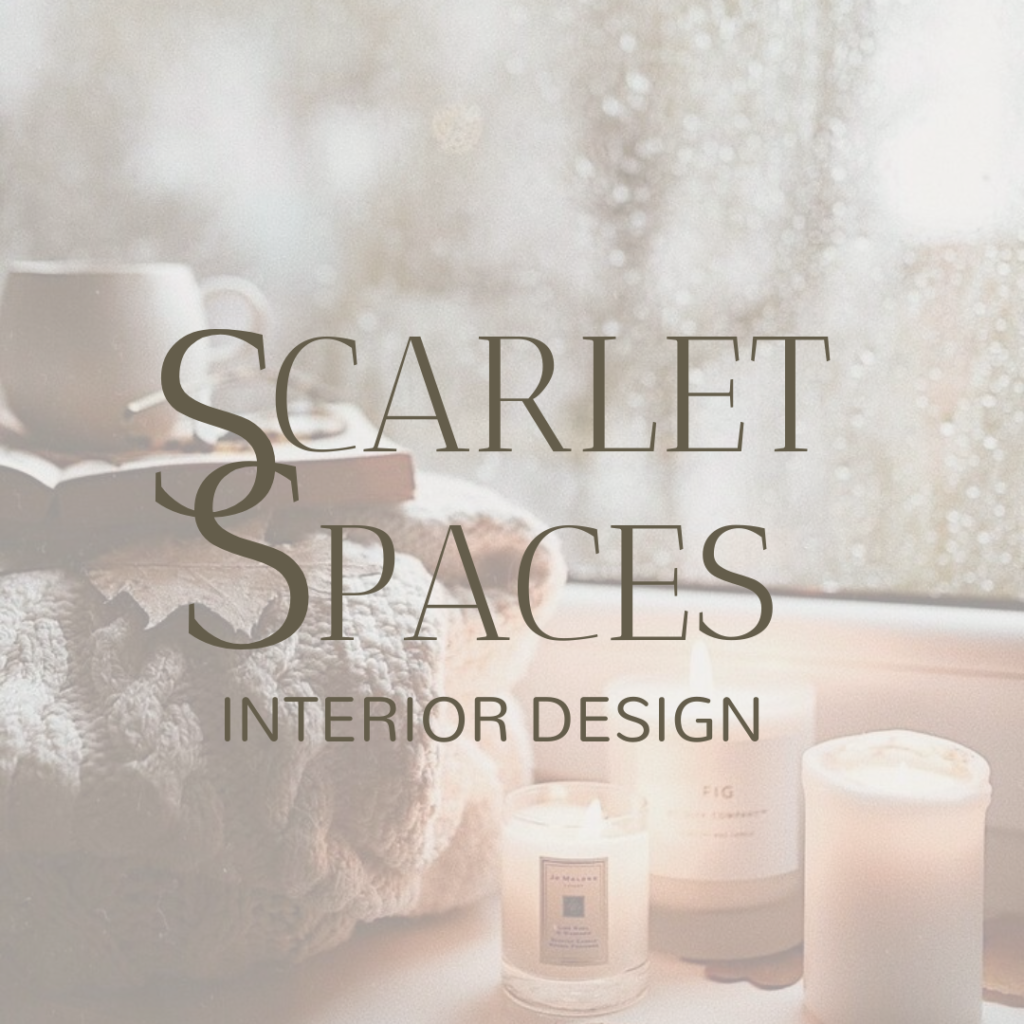
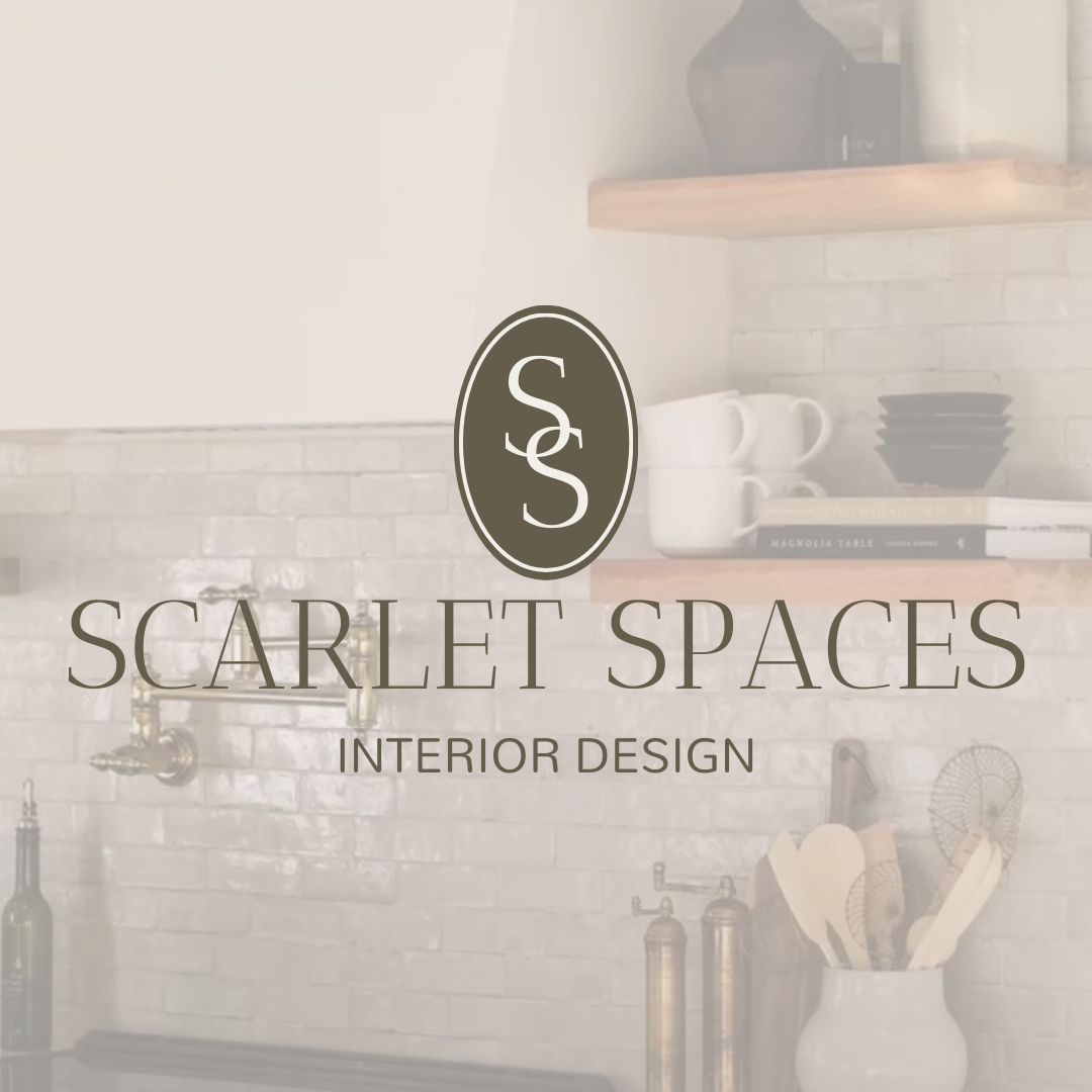
We’re diving into a behind the scenes look at the brand identity creation process for Scarlet Spaces. Scarlet spaces is an interior design company that needs a complete brand identity for their online launch.
Some words that would describe their branding goals are warm, hygge, and contemporary. With those words in mind, I started by finding images that invoked those feelings.
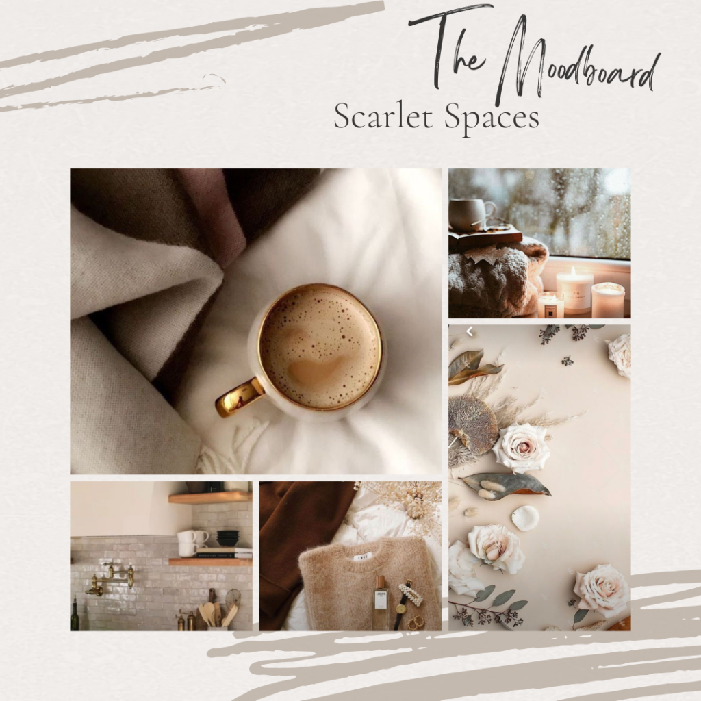
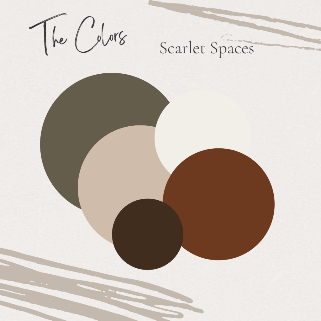
The brand descriptive words lent themselves to a warm neutral palette, but I wanted to have a few pops of color without it seeming to come out of nowhere, so chose colors that could be found in nature.
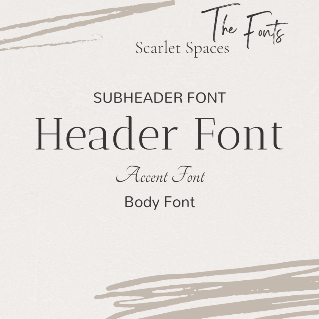
Next I trialed several font types. For the main fonts, I wanted to choose more contemporary options that didn’t lean too far towards feminine since the brand would need to communicate to a general audience. I did include a script accent font for the times a less formal touch could be used.
The interlocking “S’s” represent the coziness that Scarlet Spaces creates. The various logo elements allow for a brand that can be represented no matter what media or amount of space they have.


