We’re diving into a behind the scenes look at the brand identity creation process for Tranquility Wellness Spa. (brief)
Some words that would describe their branding goals are calming, promoting wellness, and welcoming. With those words in mind, I started by finding images conveyed that.
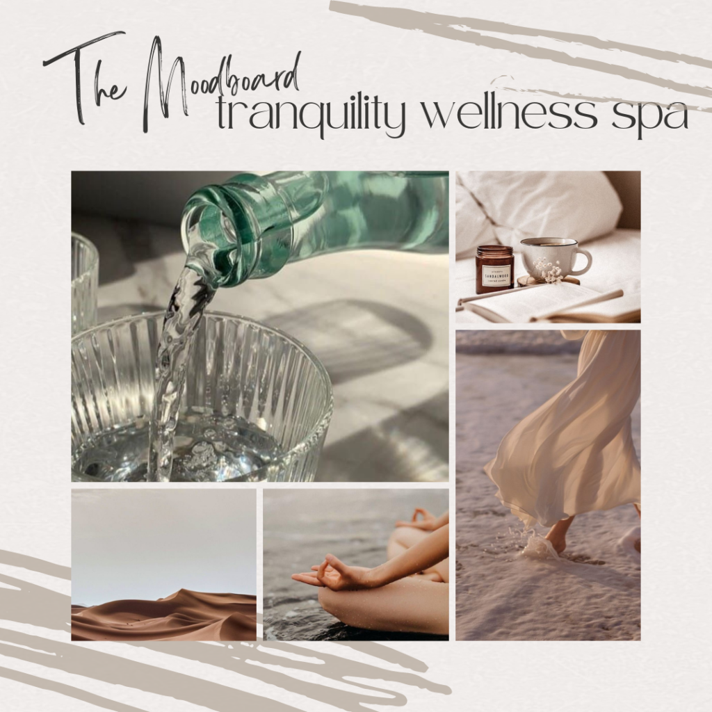
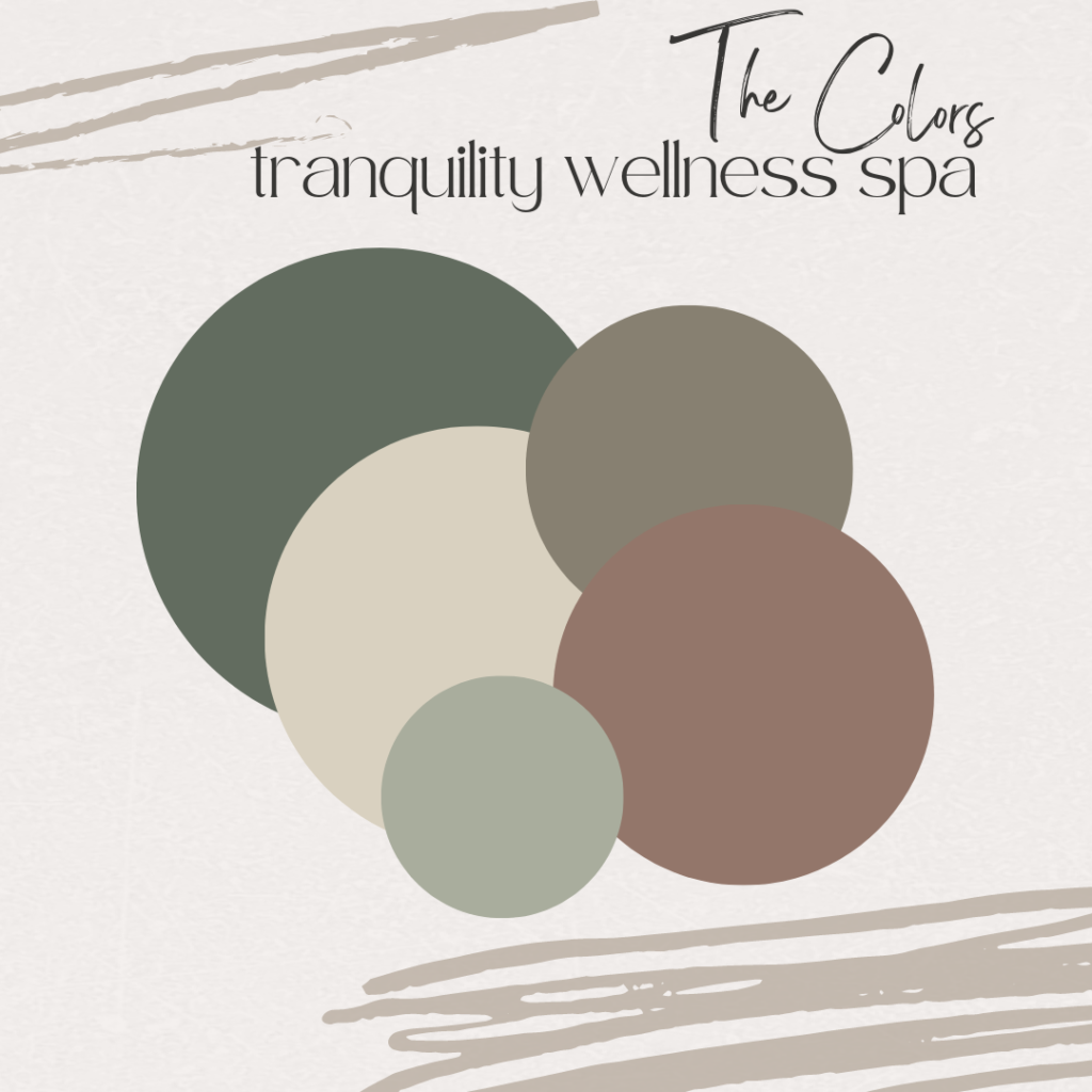
I pulled the colors from the various images. I found a few shades of green (a very calming color) from the glass bottle and worked to find neutrals to provide balance.
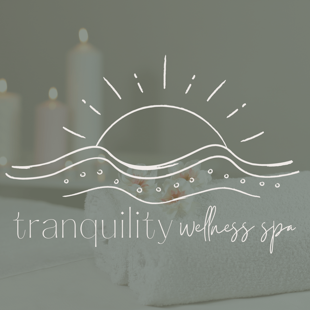
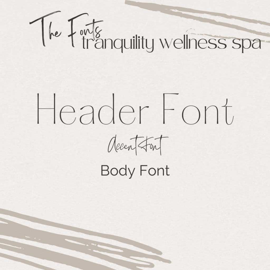
I knew from developing the brand up to this point that I wanted to main font to be very clean and minimal. The accent font needed to also be more thin to go with the main font, but I decided to go with a script font to provide some texture contrast.
The logo element was created by combining the image of a sun and waves lines representing calm ocean waves. When combined it gives the appearance of a sunrise or sunset over a body of water. This mental image creates a mental scene tantalizing all the senses– the beautiful colors in the sky and on the water, the smell and taste of the salty air, the sounds of waves and birds, the feel of the warm sun on your skin and cool water. Clients are ready for relaxation and pampering just by imagining that scene.

