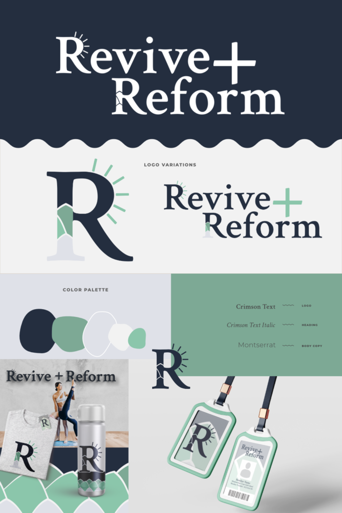
Revive+Reform is a fitness center that offers a variety of different forms of training. They’re after a brand that feels fresh and clean with a premium touch. Their important values are personal growth and confidence.
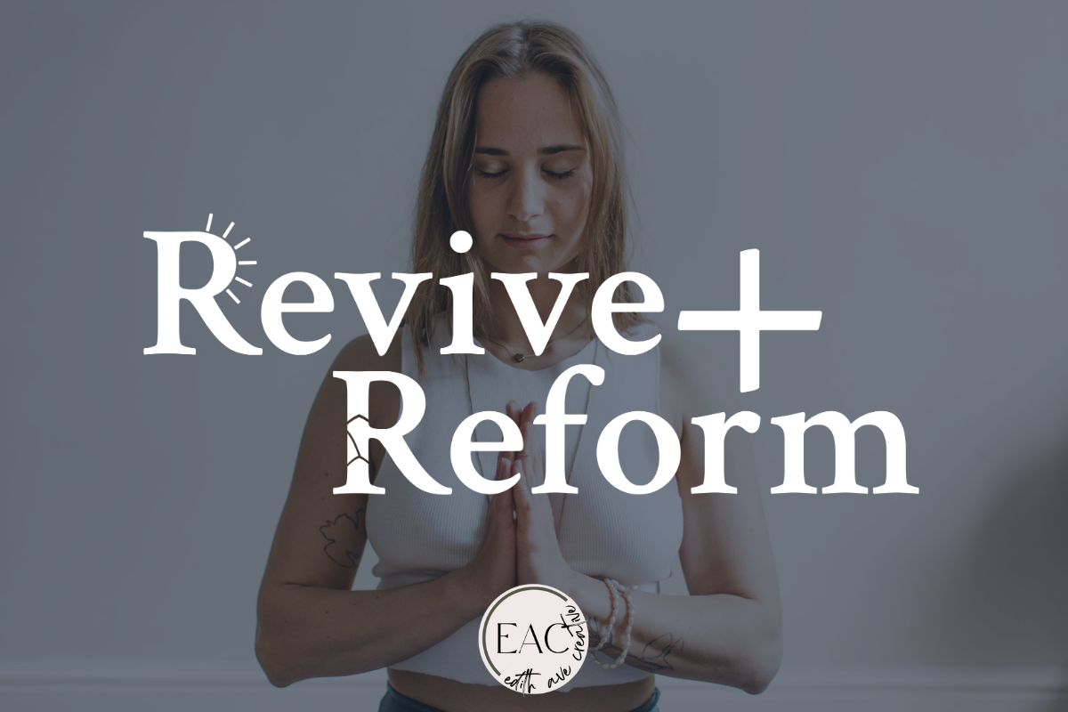
For this passion project, I wanted each of the initial letters to demonstrate the word itself. The first “R” has sun rays coming off of it to demonstrate revival. The second “R” appears to be build up from fractured pieces representing reform.
Are you interested in a brand that captures the values of your business? Send me a message to get started!
