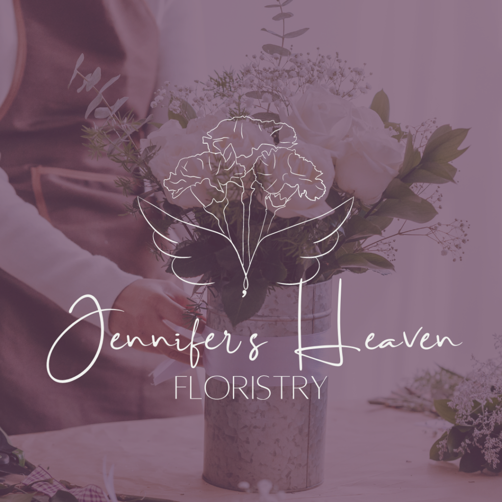
We’re diving into a behind the scenes look at the brand identity creation process for Jennifer’s Heaven Floristry (brief). Jennifer’s Heaven is a husband/wife team and they are looking to expand their business. They are ready to bring on investors and want to update and elevate their previously DIY brand.
Some words that would describe their branding goals are high end, heavenly, and professional. With those words in mind, I started by finding images conveyed that.

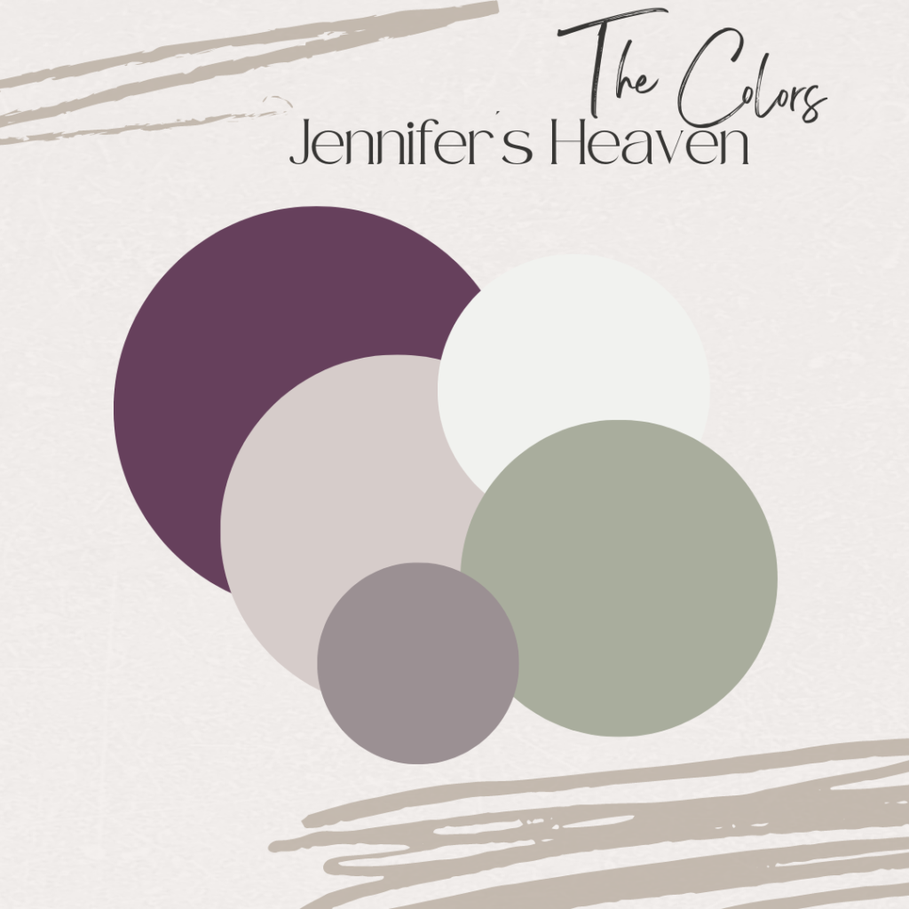
I chose purple as a focus color since it gives the idea of opulence and high-class. I also wanted to have a balance of the dark purple with some lighter neutrals. Since it is a floristry, I also selected a lighter green as an accent color to represent all the greenery they work with as well as to balance the primary purple.
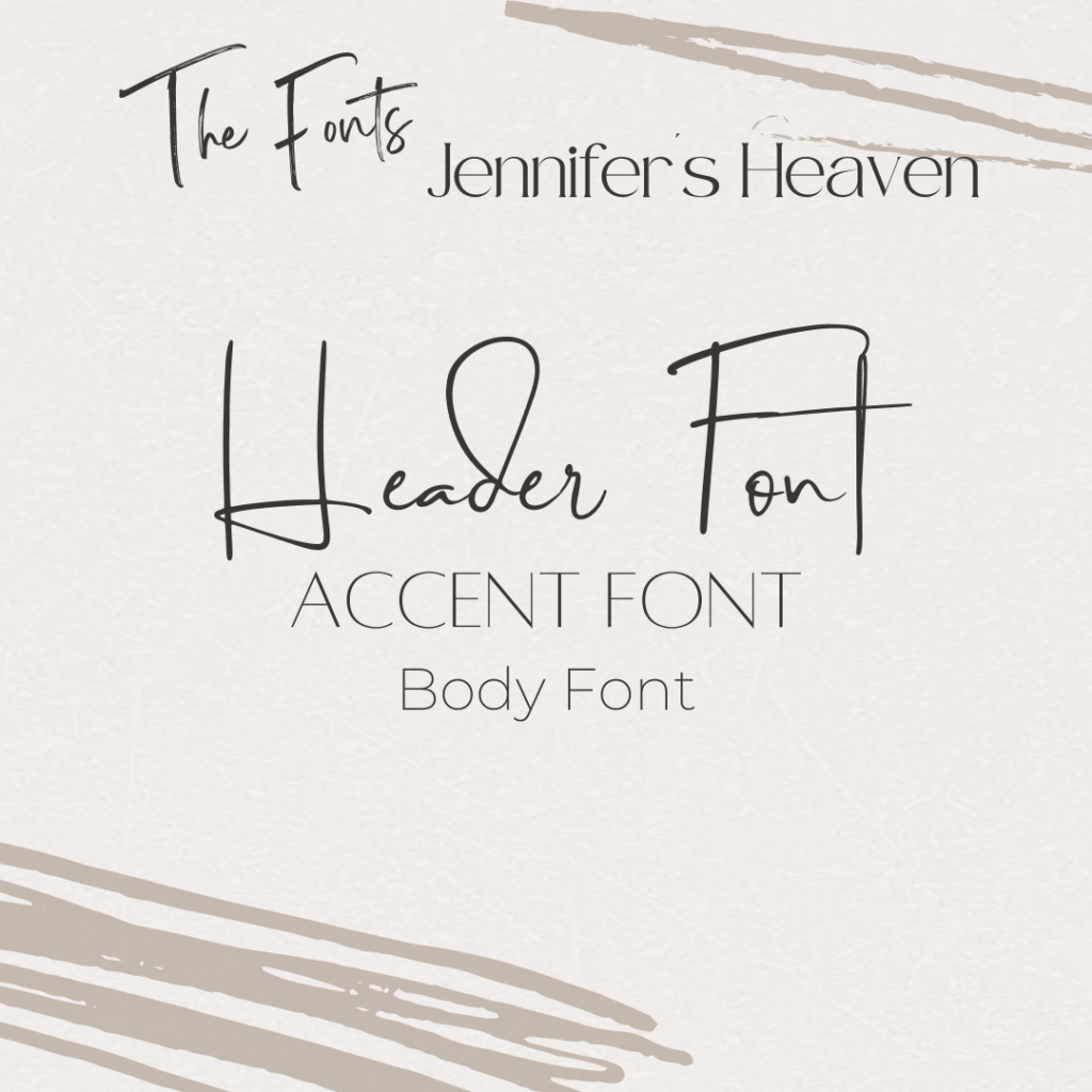
When selecting the fonts, I started by looking at script fonts that were delicate to add to the “heavenly” look they wanted for their brant. Plenty of loops in the font gives it an airy look, but it still maintains a professional look by being easily understood. Paired with a thin sans serif font to add professionalism, the typefaces balance each other while being varied enough to have some options in situations where they would need to use one or the other.
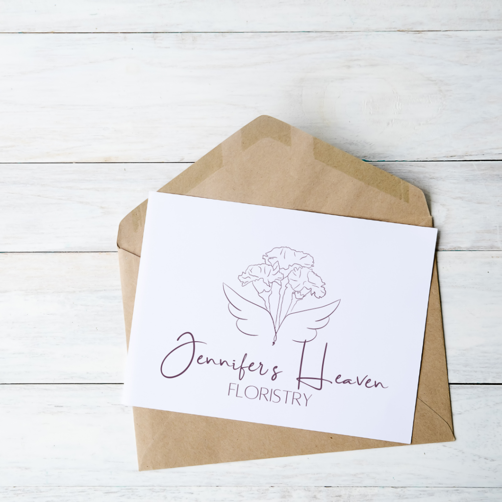
I wanted the logo to have an element that was uniquely Jennifer’s Heaven. I started with sketching thin angel wings, then added a thin-lined sketch of a bunch of flowers. The angel wings were positioned on the stems to give the illusion of being leaves of the plants too. This element worked well to have a larger primary logo, while easily lending itself to a circle submark logo and an icon for other branding needs.
